As you've probably gathered, Suivi is a tool that allows you to project a dataset into different views depending on the information you want to highlight. That's why Suivi offers 13 different views for the same board, each of which can exist multiple times and have specific display and filtering options, thus adding another dimension to the view:
Table View
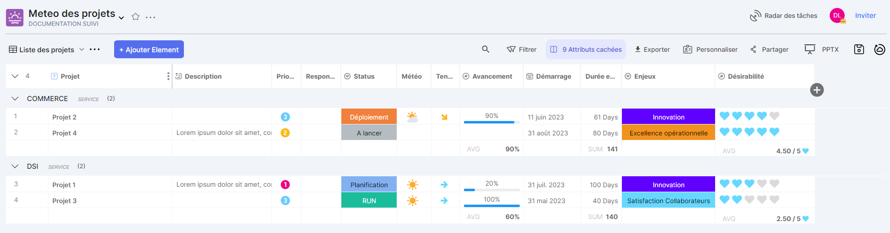
The view Painting It presents a list of items organized in a spreadsheet format, similar to an Excel datasheet (without tabs). Information for a row in the view can be entered directly into the cells or by clicking an edit button at the beginning of the row, provided the logged-in user has the necessary role and permissions on the board.
Kanban view
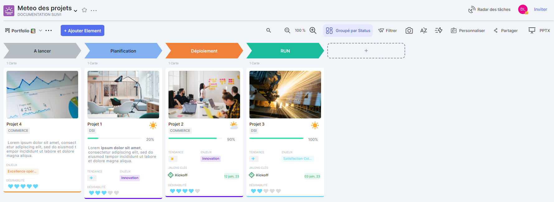
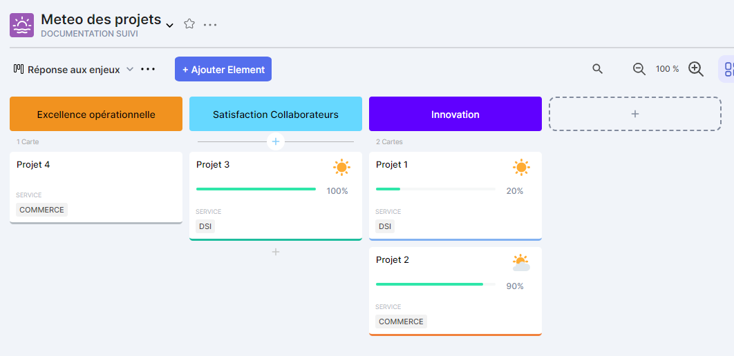
The view Kanban This allows you to display each element of the board as a card. The content of the cards is customizable. Upon initialization, the view contains no data until the customization has been completed.
Planning View
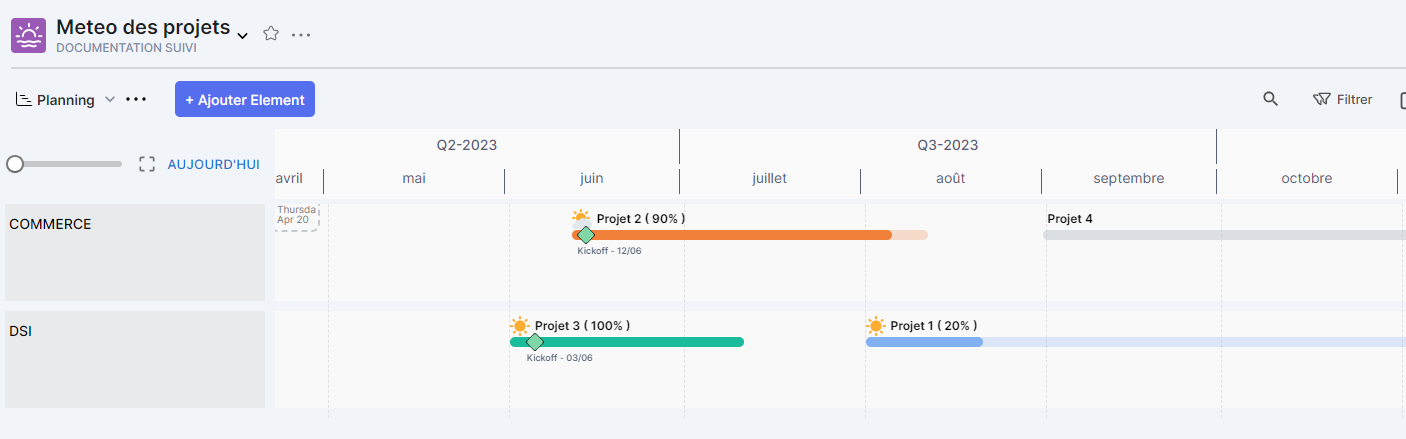
The view Planning This allows you to present a set of elements as a timeline in a schedule. The information displayed per line is customizable.
Form View
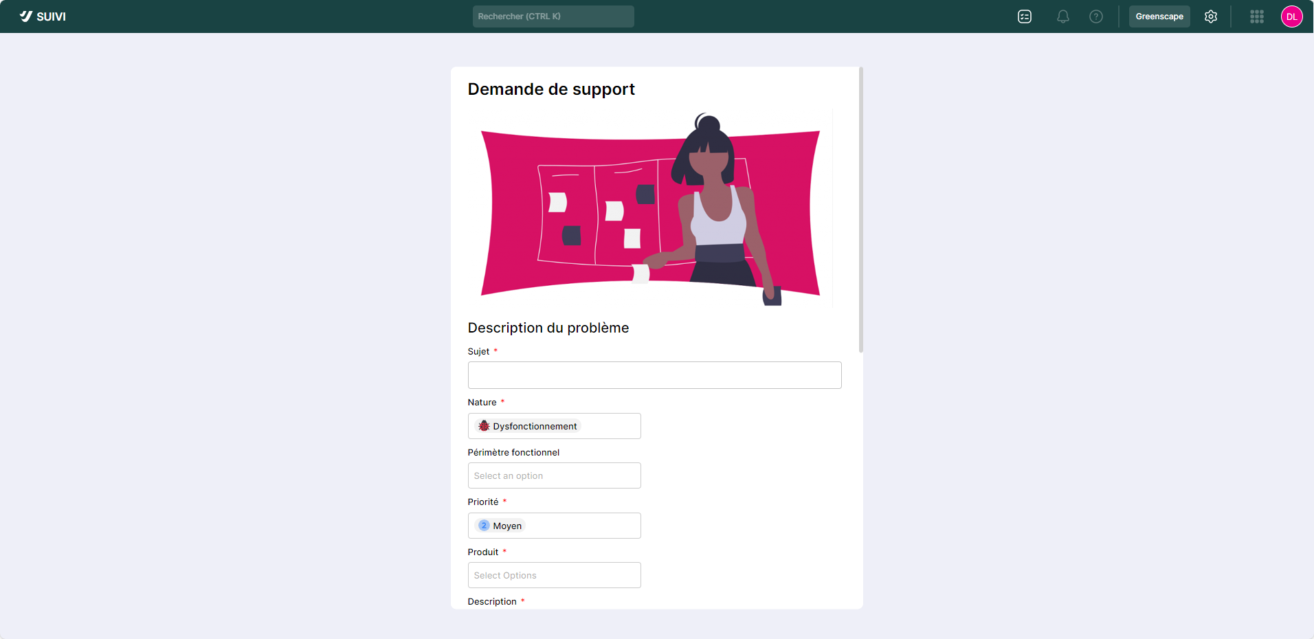
The view Form This allows you to provide a form for adding new elements to a project. This form will allow external users to enter new elements. The view can consist of fields corresponding to the different attributes of the board, as well as static layout information such as title, text, and image.
Note that fields may be mandatory or have default values
Map View

The view Map This allows you to view board elements positioned on a map or plan. For it to work, the board must have a Location attribute to provide positioning information for the element on the map (city, address, etc.).
Gantt View

The view Gantt This allows you to visualize board elements as a Gantt chart. The information displayed for each row of the Gantt chart is customizable and based on the board's various attributes (content, such as color). Of course, this presentation requires the use of a Date attribute to determine the start date for displaying the elements over time.
Roadmap View
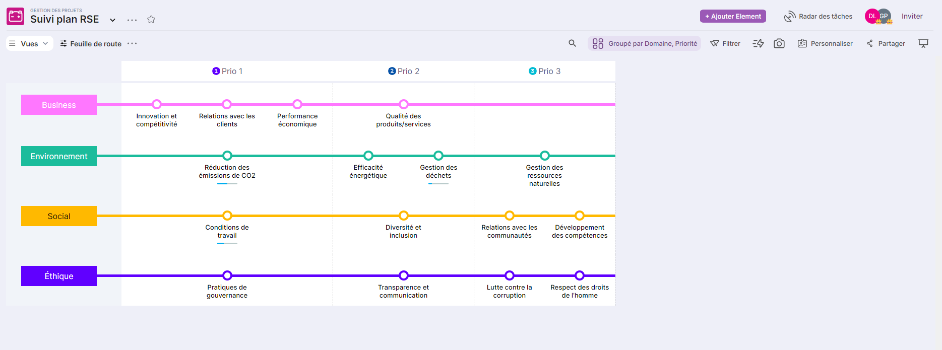
The view RoadmapThe swimlane, also known as the "swimlane," allows you to present the board elements as a functional process mapping diagram. This diagram visually represents the sequence of activities by function involved in the process being studied. In the Monitoring view, the sequence is strictly horizontal and can be displayed as bullet points or boxes aligned one after the other. Each bullet point is clickable to view the details of the process step.
List View / Details
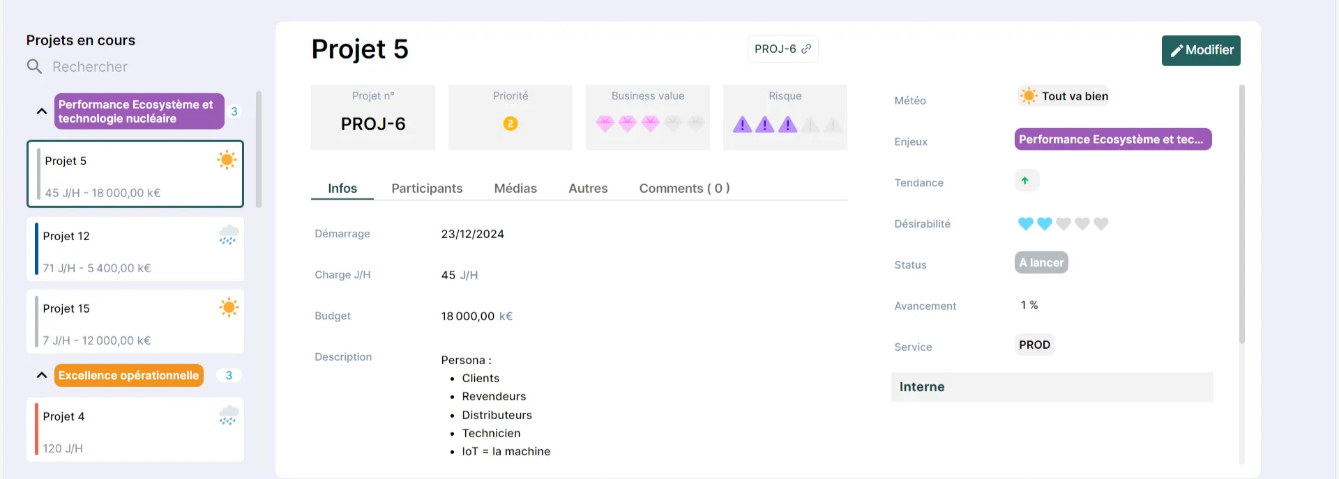
The view List / Details This feature allows you to display a summary of elements in the form of a card containing only a few details, with the added focus on the details of the selected card. The details can only be modified if the user has the appropriate role and permissions.
Calendar View
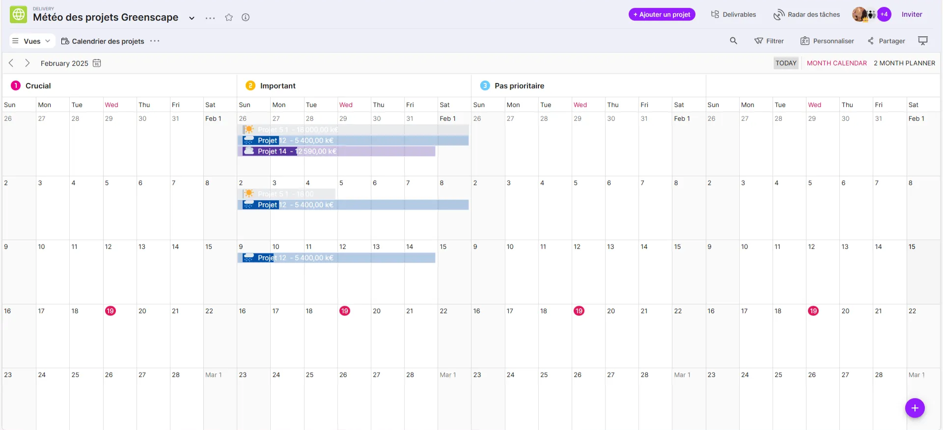
The view Calendar presents the elements on a calendar. Obviously, this requires the use of a date type attribute in the board model.
Dashboard View
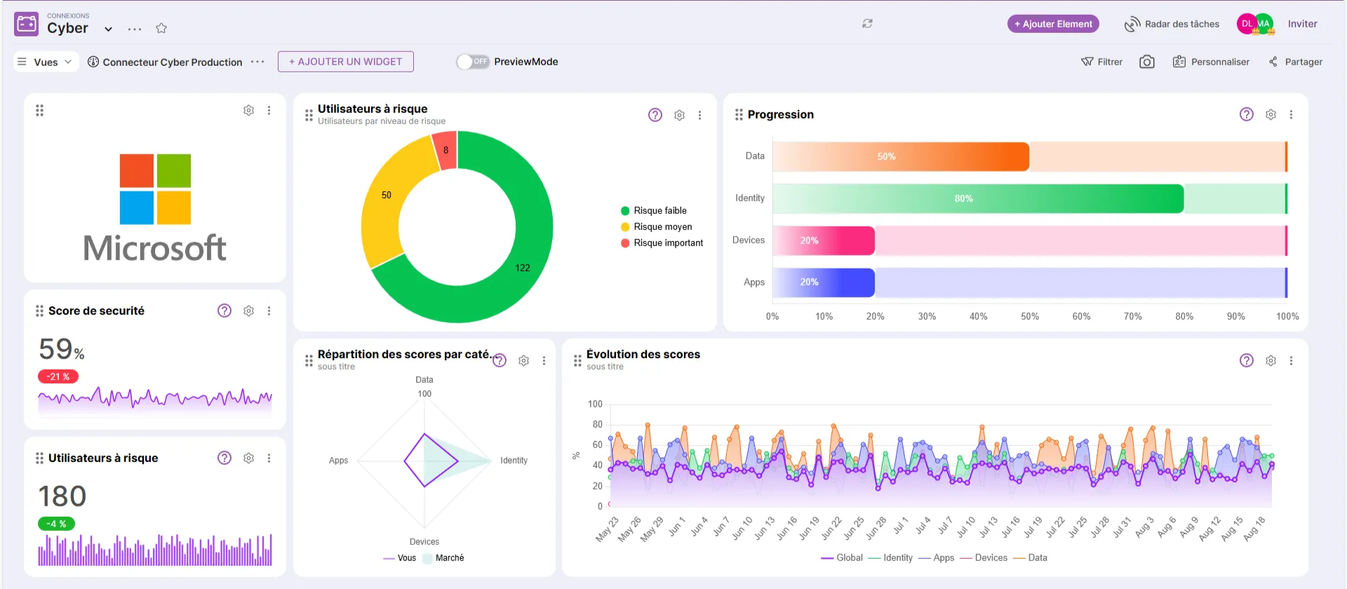
The view Dashboard This view presents a set of statistical charts based on data from board items or external data from an HTTPS connection. Building this view requires adding widgets to which the data to be used will be selected. Examples of widgets include donut charts, number charts, bar charts, line charts, and more.
Bento View
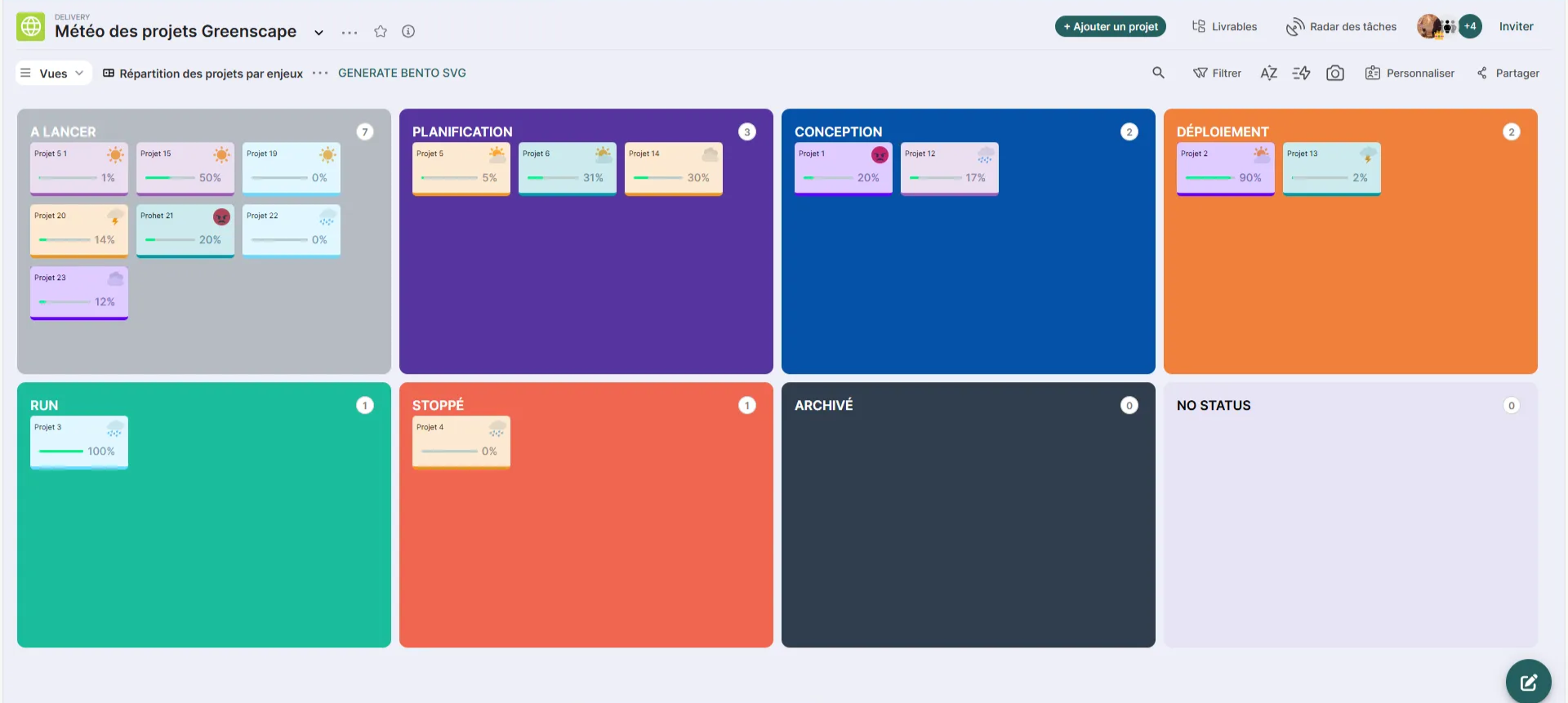
The view Bento allows elements to be presented visually in the form of modular compartments.
This view offers the following benefits:
- Modularity Organize your tasks into visual modules, like in a Bento tray, for clear and orderly management.
- Compact Vision : Get a structured overview that adapts automatically so you never have to scroll, perfect for keeping an eye on what matters.
- Customization in just a few clicks : Adapt your bento views to your needs, for ultra-efficient, customized management.
- Ease of implementation Choose a tag to categorize, arrange your compartments in the Bento view, and Tracker will take care of the rest.
Matrix View
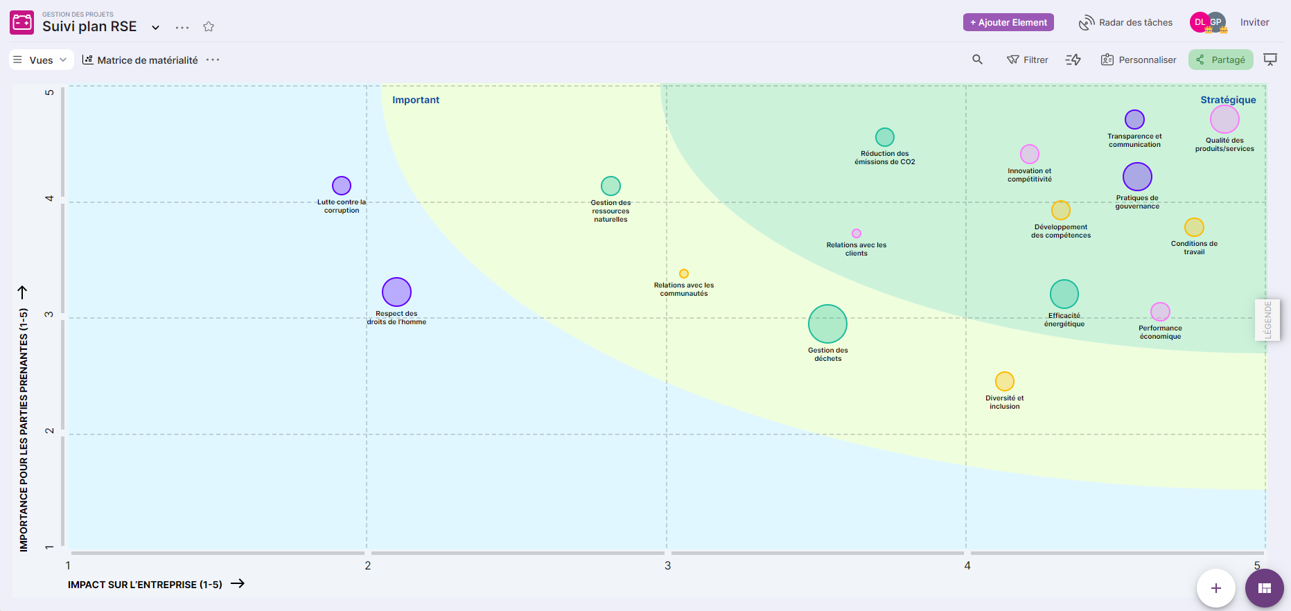
The view Matrix allows the elements of the board to be presented in the form of a matrix diagram comprising two valued axes and, for each element, a graphical representation of varying importance depending on its weight.
Summary Table View


The view Summary table It allows you to display the data as a table or a tree. When displayed as a table, it has options for grouping, which positions the grouping columns at the beginning of the table. In addition, each column has a filter field.
In tree form, each node can be closed if needed. In this form as well, several grouping criteria are possible.